The context of what we are doing to do
The purpose is to illustrate the Bootstrap. This is a very powerful and useful technique with many applications. In order to develop the idea behind the method, we are going to make use of a motivation presented in the ISLR book. We will provide some additional code and visualization tools associated to such example.
Motivating the boostrap through a hands-on example
Suppose we want to invest in two different stocks in the market. We have access to historical data of the daily returns (joint returns) of those two assets, \((X_i,Y_i) \stackrel{i.i.d.}{\sim} \mathbb{P}_{X,Y},\quad i=1,\dots,n\). \(\mathbb{P}_{X,Y}\) denotes a joint probability distribution. For simplicity, and for the purposes of understanding how the bootstrap works, we assume that these observations are independent and identically distributed (i.i.d.). We are going to allocate a proportion of \(\alpha\in (0,1)\) of our total investing budget to the stock \(X\) and the rest (\(1-\alpha\)) to the asset \(Y\). We want to make the allocation in such a way that we minimize the variance of the return of the portfolio.
In this context, the total return in terms of the proportion we invest to each asset is given by \(f(\alpha, X, Y):= \alpha X+(1-\alpha)Y, \quad \forall \alpha \in (0,1)\) , where \((X,Y) \sim \mathbb{P}_{X,Y}\) is an observation of the daily joint returns of the asset. We want to minimize \(\mathbb{V}ar(f(\alpha, X, Y))\) with respect to alpha, picking the \(\alpha \in (0,1)\) that minimizes that expression. That is, we want to minimize the variance of the daily return of a portfolio consisting of two assets, with daily returns for each asset denoted by X and Y, respectively. We use the following notation: \(\sigma_X^2 := \mathbb{V}(X),\quad \sigma_Y^2:=\mathbb{V}ar(Y), \quad \sigma_{X,Y}:=Cov(X,Y)\). We assume that we \(\underline{don't}\) know this quantities, and we assume that they exist.
Notice that \(\mathbb{V}ar(f(\alpha, X, Y))=\mathbb{V}(\alpha X+(1-\alpha)Y)= \alpha^2\mathbb{V}(X)+(1-\alpha)^2\mathbb{V}(Y)+2\alpha(1-\alpha)Cov(X,Y)= \alpha^2\sigma_X^2+(1-\alpha)^2\sigma_Y^2+2\alpha(1-\alpha)\sigma_{X,Y}\) is a polynomial in \(\alpha\). We can use simple calculus to verify that
\[\begin{equation}\alpha^*:=\frac{\sigma_Y^2-\sigma_{X,Y}}{\sigma_X^2+\sigma_Y^2-2\sigma_{X,Y}}\end{equation}\]is a global minimum of \(F(\alpha):=\mathbb{V}ar(f(\alpha, X, Y))\). Now, given that \(\sigma_X^2, \sigma_Y^2\) and \(\sigma_{X,Y}\) are unknown quantities, we can construct a plug-in estimator of \(\alpha^*\), denoted by \(\widehat{\alpha^*}\), using the data and the unbiased estimators of \(\sigma_X^2, \sigma_Y^2\) and \(\sigma_{X,Y}\), denoted by \(\widehat{\sigma_X^2}, \widehat{\sigma_Y^2}, \widehat{\sigma_{X,Y}}\) and get:
\[\begin{equation}\widehat{\alpha^*}:=\frac{\widehat{\sigma_Y^2}-\widehat{\sigma_{X,Y}}}{\widehat{\sigma_X^2}+\widehat{\sigma_Y^2}-2\widehat{\sigma_{X,Y}}}\end{equation}.\]Our objective is to know (or in statistical terms, to estimate) \(\alpha^*\), and we are going to do that through \(\widehat{\alpha^*}\) and the available data.
Theory: we have access to a data generator
We first generate some data.
alphas=rep(0,1000)# to store the data
set.seed(1)#set a seed to keep reproducibility
mu=c(0.3,0.9) #average daily returns
Sigma=matrix(c(2,-2,-2,4), nrow=2, byrow = T) #positive definite matrix
mu
Sigma
library(MASS) #we load a library to generate samples from a multivariate normal distribution
returns=mvrnorm(n = 100, mu, Sigma) #simulate 100 observations of a bivariate normal.
#we plot the resulting generated samples
plot(returns, xlab = 'X',ylab='Y', main='Joint Returns', col='red', pch=16)
#the scatter plot of the data suggests a mean near (0.3,0.9), the center of the elipse and a negative correlation between the variables, since the principal axis of the elipse has a negative slope.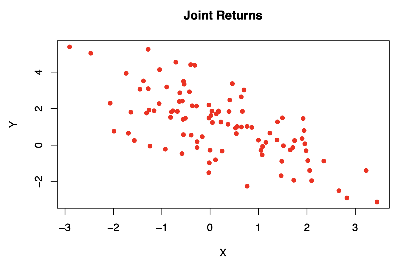
for(j in 1:1000){
set.seed(j) # to conserve reproducibility of our results
returns=mvrnorm(n = 100, mu, Sigma) #we generate a random sample
sigx=var(returns[,1])
sigy=var(returns[,2])
covxy=cov(returns[,1],returns[,2])
alpha=(sigy-covxy)/(sigx+sigy-2\*covxy)
alphas[j]=alpha

}
(alphaEst=mean(alphas))
#the output is #[1] 0.5997652
#which is very close to the theoretical value of alpha.
By the definition of \(\alpha^*\), the exact optimal alpha is \(0.6=\frac{4+2}{4+2+4}\) in this example.
We can generate a histogram of the simulated estimates of \(\alpha^*\), which helps us get a sense of the distribution of \(\widehat\alpha^*\).
par(mfrow=c(1,2))
hist(alphas, col='orange2', cex.main=.9)
boxplot(alphas, main='Box-plot of the estimates of the optimal alpha',cex.main=.7)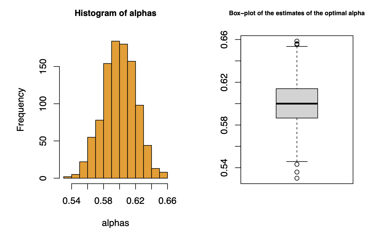
However, in order to properly assess the quality of the estimator, we need to consider the uncertainty associated to a point estimation. One of the biggest lessons that I had in my undergraduate studies was to ALWAYS associate some quantification of uncertainty to any point estimator (Henri Luigi Grandson Decks). This is one of the best ways to have a notion of how good it is and how much can we rely on our estimation to make a data-driven decision.
Formally, we would construct a confidence interval, making some assumptions or appealing to asymptotic results. In order to gain some intuition, we will just appeal to an informal rule of thumb, and deploy a crued interval. That being said, we would usually expect approximately \(95\%\) of the observations (assuming normality of \(\hat{\alpha^*}\)) of our estimations of \(\alpha^*\) to live in:
c(alphaEst-2*sqrt(alphaVar), alphaEst+2*sqrt(alphaVar))

#output: #[1] (0.5588012 0.6407292)
#which is an interval that includes the 0.6
which is an interval with small length and contains the value \(\alpha^*=0.6\), hence the estimator is one of good quality.
Reality: we have finite data (Bootstrap is our solution approach)
We now assume that we only have a sample of n=100 daily returns.
set.seed(1)
returns=mvrnorm(n = 100, mu, Sigma)
sigx=var(returns[,1])
sigy=var(returns[,2])
covxy=cov(returns[,1],returns[,2])
alpha=(sigy-covxy)/(sigx+sigy-2\*covxy)
alpha #is our point estimate of alpha #[1] 0.5977546
We would like to associate an uncertainty to that point estimation just as we did with the theoretical case. This is when Bootstrap comes in We will apply \(B=1,000\) Bootstrap samples.
set.seed(1)
#we make use of the sample function
sample(1:10, size=4, replace = TRUE, prob = NULL)
sample(1:10, size=10, replace = TRUE, prob = NULL)
#that is to gain some intuition with the sample function
#we generate 1000 Bootstrap samples of alpha
alphasBoot=1:1000 # a vector to store the simulated samples
for(k in 1:1000){
set.seed(k) #in order to have reproducibility
#we generate a random sample based on the indices of the data
samp=sample(1:100, size=100, replace = TRUE, prob = NULL)
BootSamp=as.data.frame(matrix(nrow=100,ncol=2)) #now we extract the observations associated
#to those indices
for(q in 1:100){
BootSamp[q,1]=returns[samp[q],1]
BootSamp[q,2]=returns[samp[q],2]
}
sigxx=var(BootSamp[,1])
sigyy=var(BootSamp[,2])
covxy=cov(BootSamp[,1], BootSamp[,2])
alphasBoot[k]=(sigyy-covxy)/(sigxx+sigyy-2\*covxy)
}
We can now estimate the variance of the estimator using the Bootstrap samples.
var(alphasBoot)
#output #[1] 0.0003518312
With the data generator we obtained a very close estimation to the variance
var(alphas)
#output #[1] 0.0004195125
We can visualize the observations of the alphas that we obtained through Bootstrap re-sampling.
plot(alphasBoot, main='Observed Bootstrap alphas')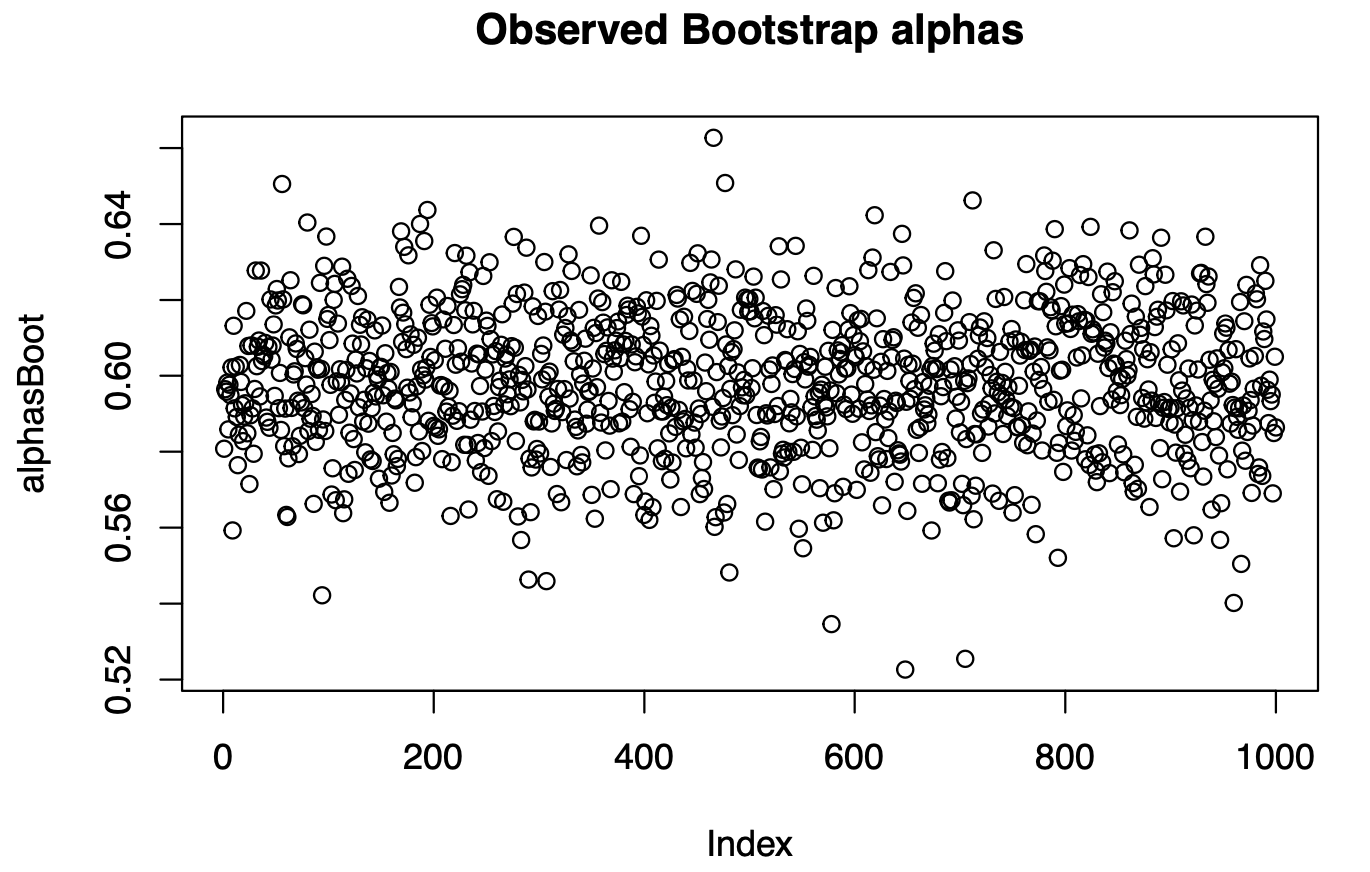
par(mfrow=c(1,2))
hist(alphasBoot)
hist(alphas)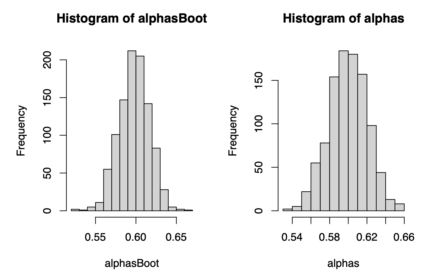
Oleee! They look impressively similar! They look VERY similar! And this is the magic of the Bootstrap method: we are getting the distribution of the plug-in estimator of \(\alpha^*\) without a ridiculously big sample, only by applying computational power to an available data.
Some plots using ggplot
library(ggplot2)
ggplot(data=as.data.frame(alphas), aes(x=alphas))+
geom_density(fill='lightblue')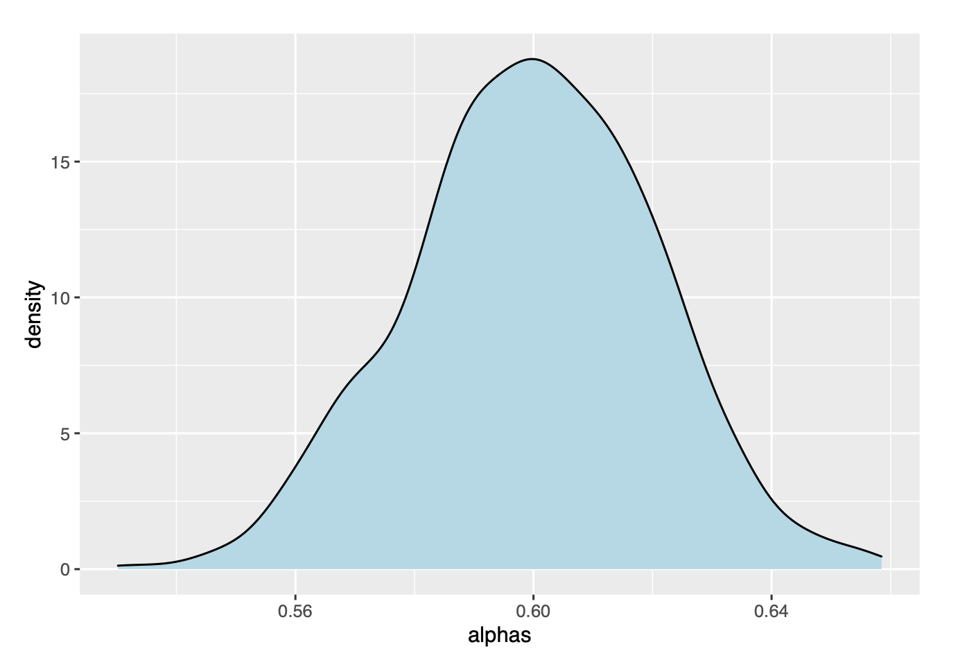
ggplot(data=as.data.frame(alphas), aes(x=alphas))+
geom_boxplot()
ggplot(data=as.data.frame(alphasBoot), aes(x=alphasBoot))+
geom_boxplot()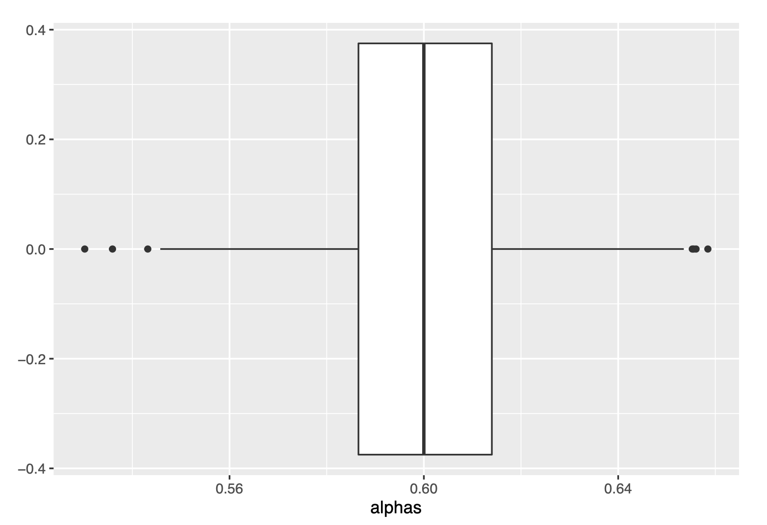
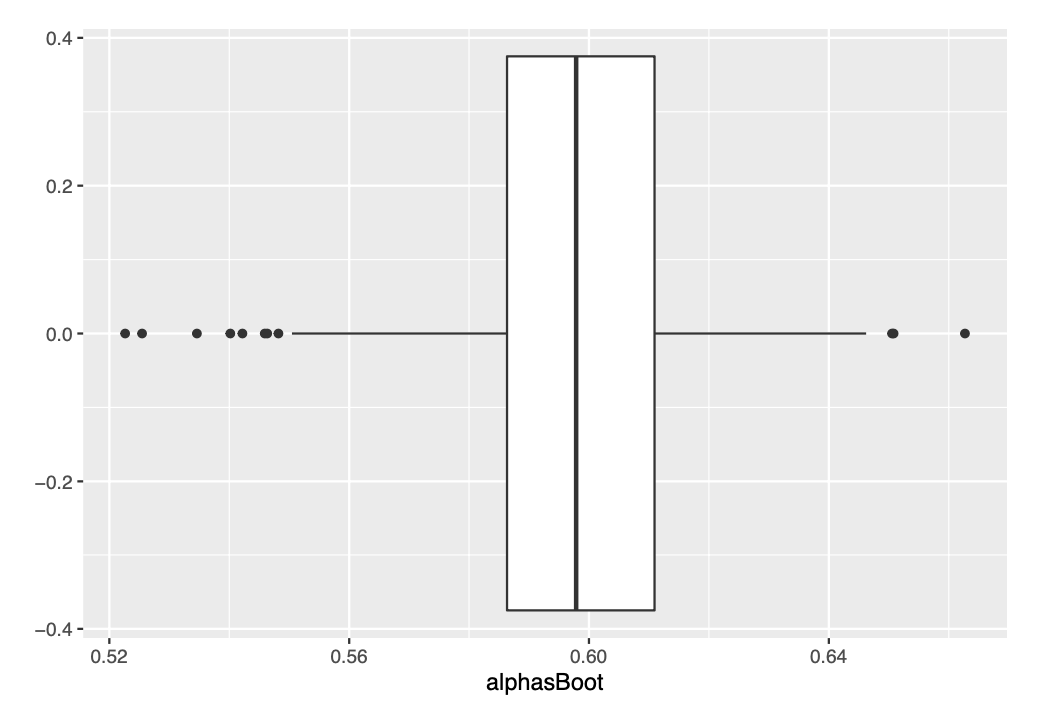
We see very similar box-plots :)
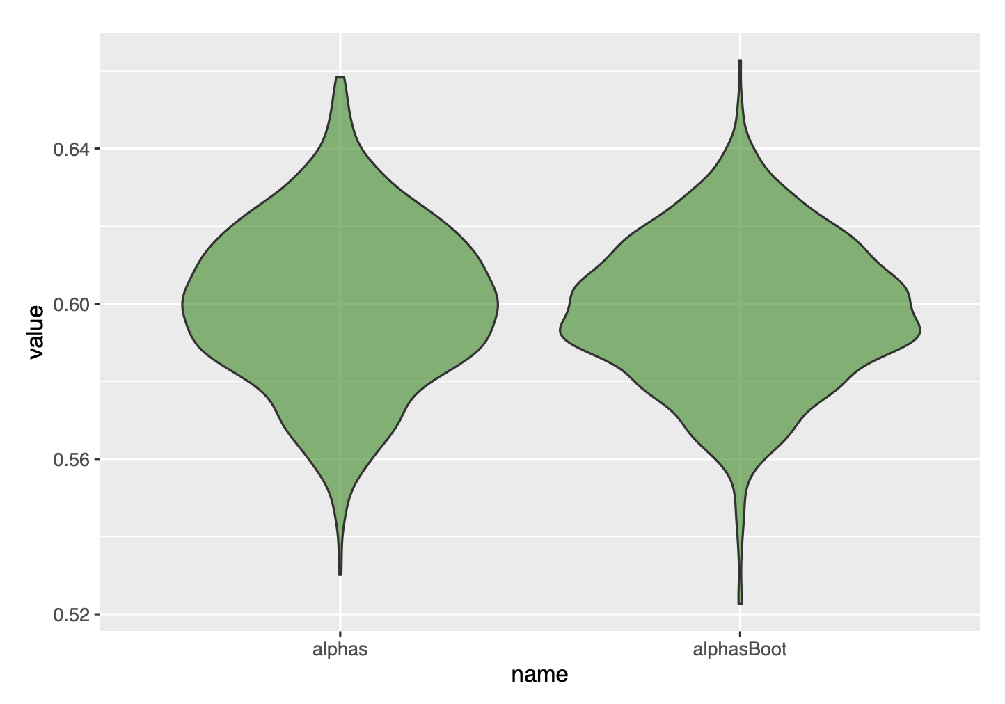
Finally, we can compare with a violin plot, and get convinced that the bootstrap gave great results.
df=data.frame(name=c(rep('alphas',1000), rep('alphasBoot',1000)), value=c(alphas, alphasBoot))
ggplot(data=df, aes(x=name, y=value), fill=name)+
geom_violin(fill='green4', alpha=.6)